User Interface: Difference between revisions
| Line 5: | Line 5: | ||
Eidos Homescreen can be categorized in Three Sections: | Eidos Homescreen can be categorized in Three Sections: | ||
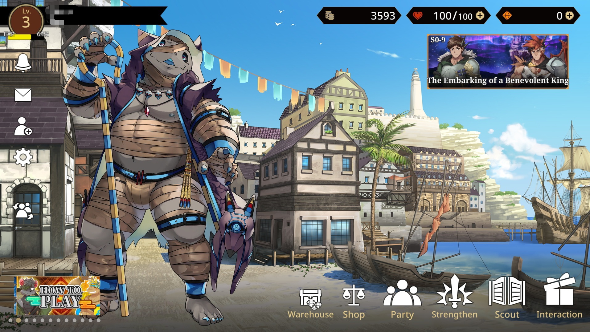
[[File: Homescreen.jpg|thumb|400px|An example of the homescreen]] | [[File: Homescreen.jpg|thumb|400px|An example of the homescreen]] | ||
'''The Top Side''' - Everything that revolves around your main | '''The Top Side''' - Everything that revolves around your main resources like Stamina, Gold and Summoning Stones as well as your Name and Level are visible on the top side of the homescreen | ||
Besides that there is also the Quest Scenario below the Area where your stamina is shown. | Besides that there is also the Quest Scenario below the Area where your stamina is shown. | ||
Revision as of 23:02, 3 January 2022
Because Someone had to dissect this horror of an UI
The Homescreen
Eidos Homescreen can be categorized in Three Sections:

The Top Side - Everything that revolves around your main resources like Stamina, Gold and Summoning Stones as well as your Name and Level are visible on the top side of the homescreen Besides that there is also the Quest Scenario below the Area where your stamina is shown.
The Bottom Side - Probably everything that should interest the player: Your Party,The Scout for summoning, The Strengthening Option, The Shop, The Warehouse and, of course the main function of the game, the Interaction with your Characters. Besides that you'll see announcements regarding banners, updates etc. in the left bottom corner.
The Left Side - Staple but lesser important features like InGame Mails, Your Profile and Friends, The Settings and a nonfunctional news function are available here. You can also Change thee character you want to appear in your Profile as well as in your Homescreen.